4. The Chart
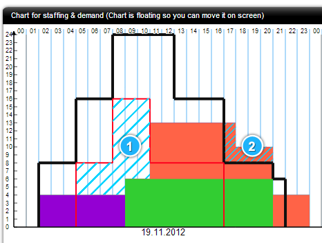
The Chart for staffing and demand displays how many people should be completing an action at any given time. On the left axis you have staff numbers, and at the top, the hours of the day.  |
|
The Chart has two lines: The black line shows the maximum staff demand, and red line shows the minimum. The Chart uploads its data from the Schedule module, and this allows you to easily compare the number of employees that are working on one action at one time. The colours in the chart match the colour-coding in the Schedule module, and is an invaluable tool to keep your staffing numbers running smoothly.
1. Anything below the red line shows you are under-staffed for that given time; 2. Anything over the black line, you are over-staffed. |
 |
